Thursday, August 16, 2007

The New dannyruchtie.nl

Finally the new dannyruchtie.nl is here! Two months later than expected but here it finally is. Not yet fully featerd, but good enough to go live. What does the mean for you, well hopefully better experience reading my blog, and... changing your url's.

The new site contains my journal, a photo archive (build by mattijs wit), my portfolio and eventual will have a Lab section where I will place my beta projects.

I build the blog from the ground up, improving and removing elements that I didn't like in blogger and wordpress and using the ones I like (mostly noticeable in the back end). Currently working on a widget, mobile and a iphone version of the blog.

This blog will no longer be used after this post, so make sure you update your url's

NEW URL's:
http://www.dannyruchtie.nl/journal

NEW RSS:
http://feeds.feedburner.com/Dannyruchtienl

Tuesday, July 31, 2007

Design Better with CRAP

Probably not what you were thinking :) CRAP = Contrast / Repetition / Alignment / Proximity and all design starts from these four basic principles

  • Contrast: Contrast refers to any difference of size, shape, or color used to distinguish text (or other elements, though here we’re focusing on text) from other pieces of text. The use of bold or italics is one common form of contrast — the difference in shape makes the bolded or italicized text stand out from the surrounding text. Increasing the size of headers and titles, or using ALL CAPS or smallcaps are other ways of distinguishing text. These techniques only work if used sparingly; a document typed in all capital letters has less contrast than one typed normally, so is harder, not easier, to read.

  • Repetition: Repetition in your text is bad; repetition of your design elements is not only good but necessary. Once you’ve decided on a size and typeface for second-level headers, for instance, all second-level headers should look the same. For most documents, two or maybe three fonts — leaning heavily on one for all the body text, with the other two for headers and maybe sidebars — are enough. The same bullets should be used on every bulleted list. Information that appears on every page should appear in the same place on every page. Design elements — like horizontal rules between sections or corporate logos — should appear the same whenever they are used throughout the document. Repetition of design elements pulls the document together into a cohesive whole, and also improves readability as the reader comes to expect text that looks a certain way to indicate certain qualities (e.g. the start of a new section, a major point, or a piece of code.

  • Alignment: Alignment is crucial not just to the cohesive appearance of your document but to the creation of contrast for elements like bulleted lists or double-indented long quotes. Your document should have a couple of vertical baselines and all text should be aligned to one of them. Unaligned text floats mysteriously, forcing the reader to figure out its relation to the rest of the document. Centered text is particularly bad (and is a novice’s favorite design trick). One immediate step you can take to vastly improve the appearance of your documents is to remove the “center” button from your software’s toolbar (or, less drastically, just ignore it). It is rarely self-evident what centering is meant to communicate, and too much centered text creates a sloppy, undisciplined look.

  • Proximity: Pieces of information that are meant to complement each other should be near each other. One great offender here is business cards and ads in local newspapers, where the name, address, and phone number are all scattered around the ad or card (for example, in the corners). Your reader shouldn’t have to seek out the next logical piece of information; rather, use proximity to make sure that the next piece of information a reader sees is the next piece of information they should see.

read the full article


MindMeister


MindMeister, the mind-mapping tool, has rolled out some new features. The site launched its beta earlier this year, and may be one of the more useful mind-mapping tools out there. Most of the upgrades involve the creation and editing of the mind maps themselves, and less with the social sharing aspects of mind maps.

Some of the new features include the ability to add links on ideas for both internal (between maps) and external (websites, email addresses) ideas, an automatic “layouter” to keep your map more tidy, and previews for notes and links. The line drawing tool has been improved to tidy up your maps as well, and the maps will now automatically resize based on the size of your map. Other good features include the ability to start a new map from a single idea, and the option to browse, search, view and rate public maps on MindMeister.


Monday, July 30, 2007

TimeDrawer


Mac OS X only: A lot of us are excited about Time Machine, the new feature set to launch with Leopard that adds built-in file versioning to OS X. However, until Leopard is released (or until you decide it's worth the money to upgrade), freeware application TimeDrawer provides an attractive, intuitive file versioning system for your Mac. Every time you update a document, TimeDrawer keeps track of your changes. You can compare your current document to itself from as little as a few minutes ago to much longer. It might take a little to get used to if you've never used file versioning, and I haven't used it for long enough to say exactly how user-friendly it is, but it seems like it might turn out to be a great alternative to Time Machine for people not eager to upgrade to Leopard.

Wednesday, July 11, 2007

iPhone Development


Looking for a way to see how your web creations will look on iPhone? Look no further. iPhoney gives you a pixel-accurate web browsing environment—powered by Safari—that you can use when developing web sites for iPhone. It's the perfect 320 by 480-pixel canvas for your iPhone development. And it's free.
iPhoney is not an iPhone simulator but instead is designed for web developers who want to create 320 by 480 (or 480 by 320) websites for use with iPhone. It gives you a canvas on which to test the visual quality of your designs.

Also Check a video cast on the iPhone Dev CAMP

Tuesday, July 10, 2007

Pownce

Pownce is a way to send messages, files, links, and events to your friends. You'll create a network of the people you know and then you can share stuff with all of them, just a few of them, or even just one other person really fast.

Screenshot of the software
Right now, there are four basic things you can send: messages, links, files, and events.

You might send an event out to a dozen of your friends letting them know you're hosting a party this Friday. They could easily get the event details you entered, respond with questions or comments and then quickly rsvp.


Say you had a great photo you wanted to share with all of your friends. Just add the file and all of your friends will get it right away. They'll be able to reply and tell you if it's cool. You could even post songs you recorded in your home studio to share with your friends.

WHO MAKES THIS THING?
Pownce is brought to you by a bunch of geeks who were frustrated trying to send stuff from one cube to another.

Screenshot 5 Screenshot 4 Screenshot 3 Screenshot 2 Screenshot 1

The team consists of Leah Culver, Kevin Rose, Daniel Burka, and Shawn Allen. Together, we formed a wee company with a great big name, Megatechtronium, that makes this software.

Monday, July 09, 2007

Leopard, Small details make a Big Cat


One day of Leopard and Tiger feels a bit incomplete. As every one else I expected big updates in Leopard. I expected more than Time machine, Core Animation, Spaces and Stacks. Why, what more do you want? To be honest I don't even know what I want more. More eye candy? I think not! My OS needs to be clear, clean, fast and I don't want it getting in my way when I work.

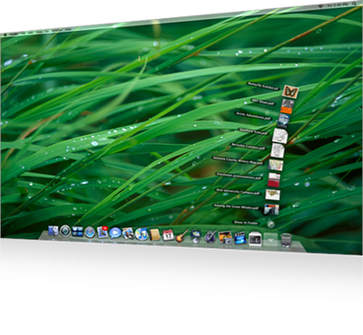
So I got my version of leopard and starting to play with it. My first impression was o.., wow Tiger with more nifty feathers, that's great, but not that big of a deal. I decided to use it for a day as my work machine just to see how it feels, doing regular stuff.
Because I had some trouble with my airport and bluetooth I decided switch back to tiger and wait for the final release in October, of course still using leopard for testing my appz.

Ones back at Tiger I immediately felt something was missing. I didn't quite know what it was, so again I switch back to Leopard and looked at the OS more closely. And than it stroke me. Leopard is really the big upgrade I wanted It to be.

Is not the new Time Machine (which is great) or Quicklook (which is even greater), Its the details. The Attention to details is what makes leopard really stand out. It's really amazing the keynote didn't pay attention to the small improvements ...than again nobody would have taken jobs seriously. You have to experience it for your self.

Apple has done a great job removing clutter and made options better accessible. Security and sharing are just easy, I mean easy, easy.

Apple uses subtle animation, we know from cartoon's (stretch and shrink) that give even better feedback of what we are doing.

So is Leopard the Vista Killer, jobs promised us it would be?
If Tiger not already was, Leopard is so much more than fancy eye candy. It's functionality that makes Leopard so much more than Vista. It's as if Apple isn't thinking different, but Microsoft is thinking complicated.

Sunday, July 08, 2007

Default Password List For Hundreds of Routers, Firewalls, Printer Servers..

You'll definitely want to bookmark this list. Very handy should you ever need to hard reset one of these devices.

http://www.phenoelit-us.org/dpl/dpl.html

Monday, July 02, 2007

About The Faces

I bought my copy of Alan Cooper's classic About Face in 1998. I remember poring over it, studying its excellent advice, reveling in its focus on the hot new UI paradigms standardized in Windows 95-- toolbars, menus with icons, tabbed dialogs, and so forth. Seems quaint now, if not borderline obsolete, but this was 12 whole years ago. That's almost a lifetime in computer dog-years.


About Face
1995


Alan Cooper About Face 2.0
2003

Alan Cooper, Robert Reimann About Face 3
2007

Alan Cooper, Robert Reimann, David Cronin
I had no idea that there was a new edition of About Face until late 2003, when I saw the new edition sitting on a coworker's desk. I rushed out to get my own copy, and I found the book much improved over the original. I love Cooper, but he can be awfully bombastic at times. Having a second author dilutes Cooper's natural bombast and adds another viewpoint for a broader perspective. The new version was better and more up to date. My old copy was officially obsolete.

I was surprised to see a comment on my recommended reading post about yet another new edition of About Face released this year. Again, I rushed out to get my own copy. Cooper is obsoleting his own books at a frantic pace; it's almost as bad as software. If, like me, you're wondering what's new in About Face 3, there's a summary in the introduction:

The book has been reorganized to present its ideas in a more easy-to-use reference structure. The book is divided into three parts: the first deals with process and high-level ideas about users and design, the second deals with high-level interaction design principles, and the third deals with lower-level interface design principles
The first part describes the Goal-Directed Design process (pdf) in much greater detail than in the second edition, and more accurately reflects current practices at Cooper, including research techniques, the creation of personas, and how to use personas and scenarios to synthesize interaction design solutions.
Throughout the book, we attempt to more explicitly discuss visual interface design concepts, methods and issues, as well as issues related to a number of platforms beyond the desktop.
Terminology and examples in the book have been updated to reflect the current state of the art in the industry, and the text as a whole has been thoroughly edited to improve clarity and readability.
I'll vouch for the readability improvement in text and layout -- this is a much better designed book overall. Adding the third author has improved the book even more, definitively obsoleting the previous version. About Face 3 is the best edition of this classic yet. If you've never owned a copy, consider yourself lucky on two counts:

You don't have to waste money on old editions; you can start with the latest and best edition.
You're about to read one of the best books ever written on interaction design. Enjoy.
I envy the experience you're about to have. For the rest of us, time to pony up the upgrade fee. Again.

If you like About Face, you'll also enjoy Cooper's The Inmates Are Running The Asylum. Originally released in 1999, it was similarly refreshed with a second edition in 2004. I own the first edition, so it looks like I'll be upgrading, too.

Friday, June 29, 2007

iPhone removeble SIM card

A view more hours to go and the iphone will be released in the US.


Thinksecret restored my hope of perhaps getting one before October. There where these rummers on different dutch tech site that the iPhone had a pre-installed sim-card in it. But now we know there isn't. And so there is still hope I can get one to work with a other serves than vodafoon or AT&T.